Congratulations on your snazzy, new website! As a smart hotelier, you have taken plenty of steps to make this new source of revenue work for you in some amazing ways. Since you have already optimized your site for search engines and built out landing pages to attract visitors, it is time to get potential guests clicking around your site. A great way to customize your independent website is to curate and optimize your website’s marketing space. “What on Earth is marketing space?” you ask…
Simply put, marketing space is the additional content on your site outside of the main page copy. This “bonus material” is the added touch that will keep users engaged with your site for a longer period of time. Consider what you see when you are on a well-designed website. Is it just a block of text? Is there a large image introducing you to the page? Is there a series of images on the side of the page you can click on? Maybe there are even larger images that are incorporated into the main copy directing you to other relevant pages on the site. These elements are what digital marketers refer to as “marketing space” and they hold incredible value to your hotel’s website.
Today we will explore not only why this content is valuable to your site, but what practices you can implement on your own website’s marketing space to create a strong, aesthetic appeal and drive users to book more rooms.
The Value of Marketing Space
What Makes Your Hotel Special?
Marketing space provides you with a unique opportunity to show off the signature amenities that make your hotel truly one-of-a-kind. Think of it this way: is your hotel just a “Hilton” or are you the “The Hilton Melbourne Beach Oceanfront”? This content is more than fluff – these details show users what exactly makes your hotel special. Take advantage of this space by creating engaging content to show off your skyline views or direct users to learn about your hotel’s award-winning restaurant. Additionally, these spaces provide an opportunity to create a link to relevant content on your site. Internal linking can strengthen your hotel’s SEO campaign and showcase your signature amenities and features to a wider audience.
Marketing Your Niche Landing Pages
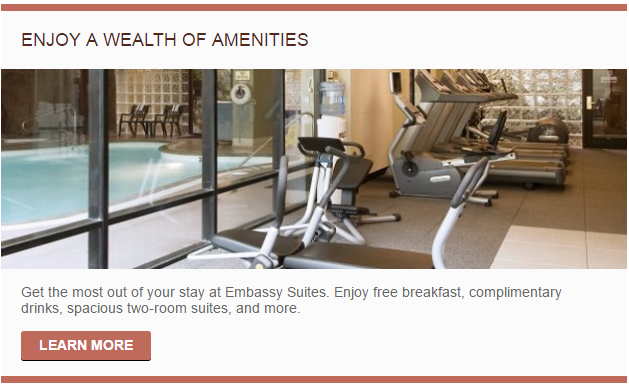
Most independent websites, especially those that have been around for a while, have several niche landing pages. These pages are designed to be highly useful to a select segment of users. Specialized landing pages see less search engine traffic than your home page or rooms page as they are optimized for highly-qualified audiences, with terms that often have low search volume. Niche landing pages are prime candidates for directing users through your independent website with the use of marketing space. Consider what happens if a user lands on your homepage but is still not committed to staying at your hotel. He or she may become interested in learning more about your amenities when they see a callout box that reads, “Enjoy a Wealth of Amenities,” like the example below.
While reading through the amenities, a sidebar referencing a popular, local attraction catches their eye. The user clicks through and discovers a relevant special on the attraction’s landing page and is inspired to book. Even if these niche pages rank #1 on their primary keyword for a Google search, they can always benefit from qualified, internal traffic. Callout boxes and sidebars give users that were not planning on staying on the site more reasons to browse your content, and ideally direct them to a page where they will be inspired to book a room.
Keeping Users Hooked
If you have ever been on a website whose sole purpose of generating content is to encourage return visits (BuzzFeed, Facebook, Newsweek, etc.), you have already seen (and possibly interacted with) one of the most common uses of marketing space: advertising. In the case of your independent website, this space is best used as an advertisement for your hotel! Remember: potential guests are on your website to learn more about your hotel. The most effective ad to show them will highlight the most unique, interesting, and important aspects of your property and local area. With that in mind, why not use an otherwise empty space to direct users to interesting sections of your site that they might have not visited otherwise? And, like a typical online advertisement, your marketing content will follow the same basic principles of using images and copy within a limited space to facilitate engagement with a viewer.
Think about how much time you spend on a given webpage and how thoroughly you review the content before moving on. Do you expect users to spend more than a few minutes reading about any one aspect of your hotel? With waning attention spans, users will be looking for something to excite them while looking at your page. By adding engaging and clickable content to your page, you are creating an opportunity to connect with your visitors and increase the amount of time they have already invested. Eventually, they will reach a page that convinces them to book a room because of the unique, engaging content you have created.
What Content Should Be On This Space?
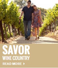
Let’s break down how you can use your site’s marketing space to highlight new content your users will love! Keep in mind the unique style of your hotel and how you want to convey that voice on the independent website. If your hotel is elegant and high-end, you will want to use your marketing to convey class and wealth in its voice. See how the below callout boxes use terms like “savor” and “culture” and how the images show either high quality amenities or luxurious destinations.
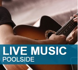
Family-friendly hotels often use their marketing spaces to show spontaneous and fun getaway locations. These sidebars are designed for the type of traveler who wants to explore a city’s attractions or enjoy entertainment at their hotel. Don’t think too much about how these objects speak to you, but how do they speak to their audience.
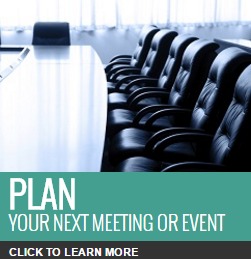
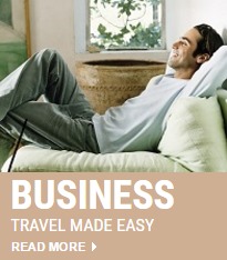
Professional, business class hotels should use this space to give potential guests feelings of convenience, comfort, and value. The sidebars below focus greatly on professionalism and highlight different aspects of business travel. The first example promotes the hotel’s meeting and event space and shows off a clean and modern conference room. The second example emphasizes the hotel’s guarantee for relaxation and comfort at a competitive price. These features may not be attractive to a couple planning their honeymoon, but speak volumes to professionals planning a business trip to the area.
No matter your hotel’s audience, your website can provide valuable, relevant, and effective content to optimize for conversions. Marketing space is a great way to say, “We have what you are looking for.” Remember that your hotel has a unique target audience. Assuming the point of view of that audience is vital for creating relevant and effective content to drive booked room nights through your independent website .
You can include different content on different marketing spaces to provide variety to your users. In our experience at Blue Magnet, we have found each marketing space accomplishes specific goals. Bear in mind that this always works best when you maintain the same “voice” throughout the entire page. Here are some effective ways you can capitalize on the most commonly used marketing spaces on your independent website.
Mastheads
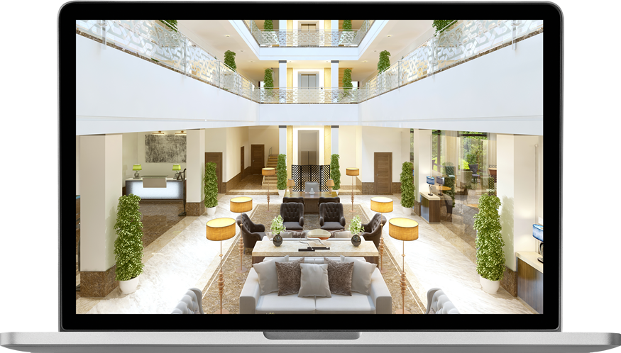
Mastheads are large banners that appear at the top of a page. Users will likely see this image before they have the chance to read any content. For this reason, we often use mastheads to introduce the content. An effective masthead creates a positive first impression for the reader and fosters engagement. To achieve this, select a high resolution image that is relevant to the page’s copy and enhances the overall user experience.
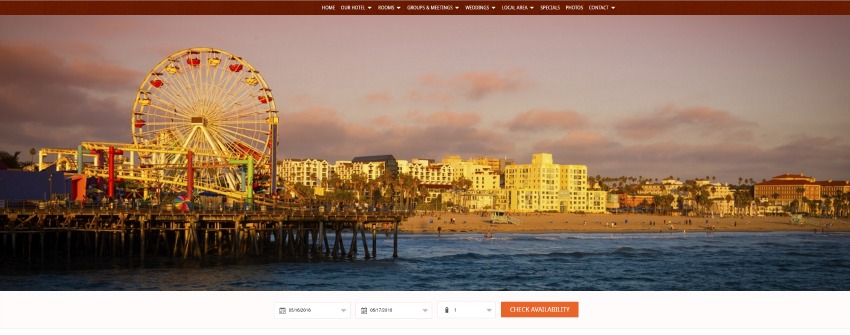
For local area pages, use a photo of that attraction (just be sure to keep usage rights in mind to avoid trouble with the law). The masthead should be as unique and eye-catching as possible; your goal is to stop a user in their tracks and make them want to read the page. If the image you’ve selected is of high quality and relevant to the page’s copy, you are on the right track to creating an amazing masthead.
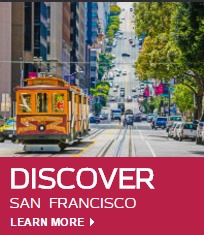
For example, the below masthead helps introduce the local area of Los Angeles to families and vacationers, therefore a sunset picture of Santa Monica Pier (a major local hotspot by the beach) is the perfect choice.
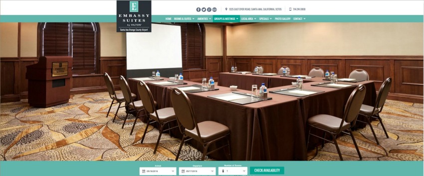
Or, see the below masthead referencing a hotel’s meetings page and ask yourself what you would like to see if you were looking to plan an event. Would a wide shot of a hotel’s spacious meeting area grab enough of your interest to keep reading? Remember that the photo serves as an introduction to the content, so it should not only be of good quality but also relevant, and complementary to the copy.
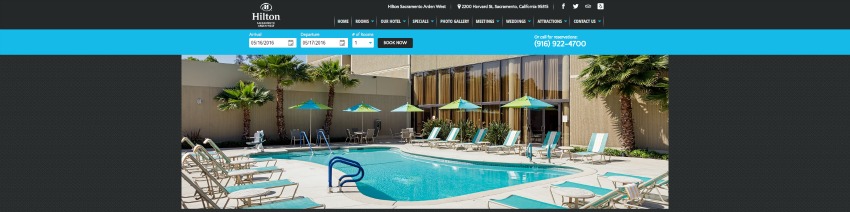
If you are planning to visit Sacramento and are researching a hotel’s amenities, what do you hope to see? Most guests would probably want to see the beautiful location and the hotel’s signature amenities, like a sunny photograph of a crystal clear pool.
Sidebars
Sidebars live on the outer margin of your page, framing your copy and main content in a way that doesn’t distract the reader. These are usually smaller photos intended to funnel users to another page of your website. Sidebars show users content from other pages they might be interested in. Successful sidebars have short, actionable copy. Since, space is limited, your ideal copy will be as close to a single action verb, (Dine in, Go out, Relax, etc.) as possible. To add some originality and personality, include a small modifier to maximize engagement (For example: Save Now with special offers, or Say “I Do” in Bellevue) . You should be using this space as a call to action that can funnel visitors to pages designed to drive more booked revenue, event RFP submissions, or other property-specific goals.
Notice how this sidebar uses a stylish and interesting wedding photo to showcase the hotel’s wedding space. Guests who visit the site and are interested in planning a wedding will instantly be drawn to a fresh image, assisted by actionable copy that invites you to plan not just any wedding, but your dream wedding.

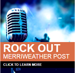
Notice how another hotel enhances an otherwise standard stock photo with quick, snappy copy that reads “Rock Out” with “Merriweather Post” set in smaller lettering below it. If users are unfamiliar with the area, they may ask themselves, “What is Merriweather Post?”, knowing only that it’s a place to rock out. And if they, like myself and Dee Snyder, want to rock, they’ll click on the link and learn about the concert venue located just a few miles away from the hotel and the complimentary shuttle service to and from the venue.
A strong example of creative sidebar usage came from one of our account managers who built out a landing page for a local Renaissance Faire. This account manager took the same sidebars that were found on most other pages but reworked the copy to suit the medieval theme of the page!
In this case, an already strong sidebar that could be found across the site directing users to learn more about hotel amenities…
…was modified to fit the voice of the Renaissance Faire landing page.
This is a fairly minor change, but provides an amazing opportunity to engage with the niche audience reading about the Renaissance Faire.
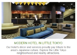
Callout Boxes
Callout boxes, like sidebars, feature a single image with short, actionable copy. However, unlike sidebars, they sit in the middle of a page, ready for a user to read as they reach that section of the copy. Generally, callout boxes can be found on a website’s home page. On the homepage of your site, this is the wildcard of marketing space as it can be used for many different purposes and you have a lot of freedom in how to work with it. Since the home page introduces your hotel to website visitors, use callout boxes to showcase your hotel’s most unique selling points or drive users to your website’s highest converting pages. It is a simple and easy way to direct users to your popular pages that are likely to drive revenue.
Take a look at the below callout. Its design is simple and clean and showcases the hotel’s room features in a unique way. The filters are designed to match with the rest of the page, yet the bold lettering and borders allow it to stand out without disrupting a user experience.
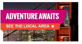
Like the image above, the below image features colors that fit in with the website’s background. However, it takes a different approach by not altering the image itself too much. Instead, the text overlay invites the reader to embark upon an adventure in the Bay Area.
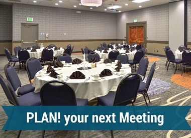
Consider how the below image turns the hotel’s meeting space into the “main event” (so to speak) and keeps the copy closer to the bottom of the image. The call to action remains easy to see, but provides an attractive and unobstructed view of the hotel’s conference space.
That being said, the home page is not the only opportunity to use callout boxes. When you are looking to inspire users to click on relevant content, breaking up page with something more eye catching than a simple button is exactly what the doctor ordered. Select an image that is relevant to the page the callout box links to and use a few words signifying what content a user is clicking on. You can even take an image and plug it into a photo editor like Canva or Photoshop to create something wholly unique!
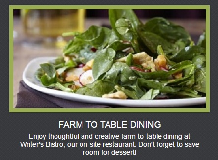
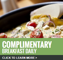
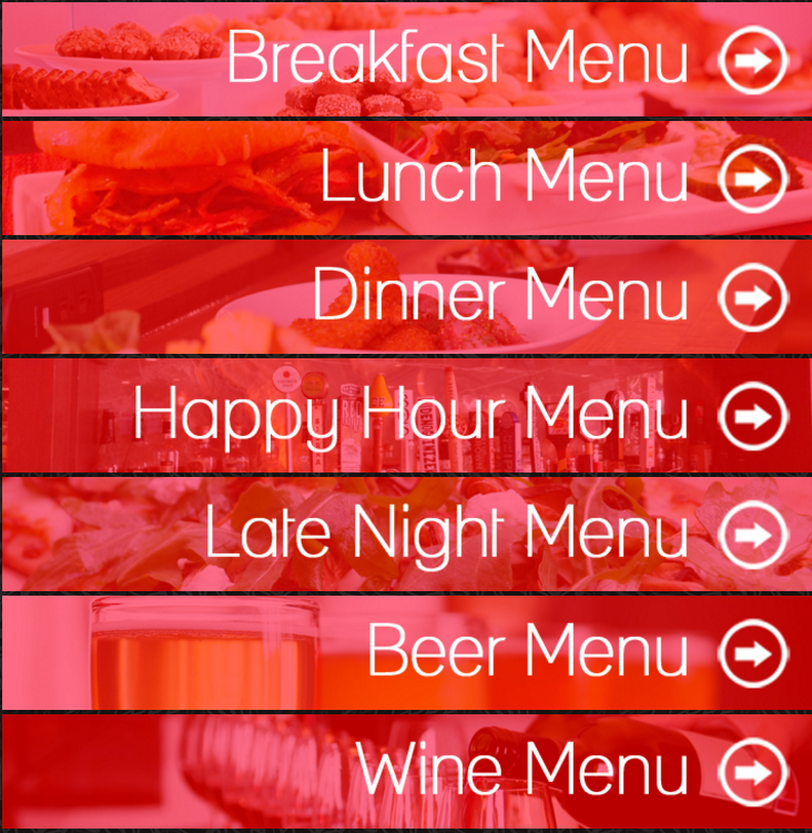
The below callout boxes direct users to the menu of a hotel’s on-site restaurant. Each image is unique in its own way with a food item that fits with the menu, but all have been customized to follow a similar theme and to act as buttons, enticing users to click and learn more about what they will be dining on.
Being Creative in Small Spaces
When optimizing on your marketing space, you need to be creative with a limited amount of room. It is necessary employ strategic design elements within this space to convey effective, actionable copy. There is an old saying that “limitations breed creativity,” and this is where you can put that to the test. Consider the theme that you want to convey sitewide, on each landing page, and on the page you are linking to. Ask yourself, “How can I tie all of this together?” In these situations remember that less is more. Use short, actionable copy (if you choose to have copy at all) and unique, high-quality images without giving away too much.
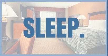
If you are rewriting The Count of Monte Cristo over a stock image of a city, the photo likely will not see many clicks. However, if you are providing a photo of a unique menu item with four words encouraging users to dine at your on-site restaurant, they may want to read more about what you have to offer. Some of our sites have successful callout boxes that have simply one word, like “STAY,” over a background that matches the site’s color scheme. Using a minimalist design can work incredibly well as long as it speaks with the same voice as the rest of your site. Remember to always leave the person viewing your space wanting more and they will be inspired to click through to learn more.
Tracking Success and Making Adjustments
The best way to determine the success of marketing space is to ask yourself two questions:
- Are people clicking my links?
- Are the people clicking my links engaging with the site and helping me reach my goals?
You can answer these questions by tracking the activity of your website in Google Analytics, which allows you to monitor how users are interacting with different elements of the site. In the case of marketing space like mastheads, check if users are more engaged and staying on your site longer after adding it. This can be seen by longer time on page and a lower bounce rate. Likewise, for call out boxes and sidebars, you can track how often users are clicking. If users are interacting with your site, then you have made a good call! If it is not seeing much activity, review these elements and look for opportunities to improve.
A/B Testing: Your New Best Friend
When a sidebar can be used on multiple pages, you have the opportunity to create more than one version. Test variations of your sidebar by attaching a different event tracking code to see how users interact with them. If users are interacting with one sidebar more often, you can anticipate that it will be more successful across the site and replace the sidebar that does not perform as well.
Making it Work!
Properly curating your marketing space can take a well-designed website and make it fantastic! Remember that using this space ineffectively can turn users away from an otherwise strong website. Much like seasoning food, you just need to complement the main feature you are presenting. Overshadowing existing content should never be the goal. When used properly, optimized marketing space can funnel visitors to your highest converting pages, increase engagement, and drive revenue for your hotel.
If you are choosing to manage an independent website on your own, do not be afraid to be ambitious and bold. There is always a new way to promote your pages so play around and find what works for you and your audience. However, it is sometimes better to work with experienced consultants to find the best methods to improve your independent website. If you feel like that is the case for you, reach out to our team to learn more about our phenomenal services!