
When visitors arrive at your hotel website using their mobile phone what do they see? Is it easy for them to book a room? To find directions? To call the hotel? Or have you forced your potential customers to try to view and navigate your standard website–which was designed for large computer monitors–on a small, mobile screen about the size of a playing card?
If your customers are still pinching, zooming, scrolling through your standard website on their mobile devices, it’s likely that you’re losing out on room revenue from mobile visitors due to your hotel website’s frustrating mobile experience. Discouraged customers will book elsewhere if it’s too difficult for them to navigate your mobile website. Stop driving paying guests to your mobile-optimized competitors by creating a mobile version of your own website!
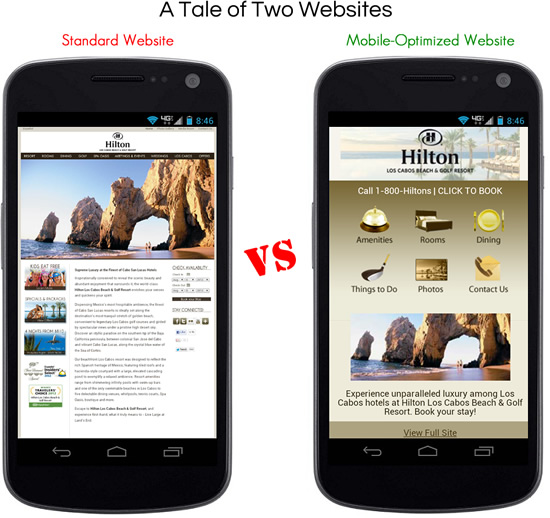
Just take a look below at how a standard website appears on your mobile phone versus the mobile-optimized version. As you can see, the mobile optimized website on the right is much easier to read and navigate right from the get-go–no zooming required!
As a hotelier, being able to communicate effectively to your potential customers on their mobile phones can have a tremendous impact on your bottom line. Unlike a standard computer, most people are tethered to their smartphones all day, every day. Think about it: if you’re a smartphone owner, try to recall the last time you were separated from it for more than 10 minutes. Chances are that gadget is next to you at all times: while you eat, while you sleep, while you commute, while you’re at work and maybe for some of you it’s even with you in the bathroom. Your mobile phone is an always-on, omnipresent device that’s connected to the internet 24 hours a day, thanks to the wonders of fast 3G/4G data streaming. The chances of someone searching for your hotel on a mobile phone are quite high when you consider how much time we smartphone owners spend with our gadgets. This is great news, because there’s nothing a marketer likes more than an always-connected audience to advertise to.
Why bother with a mobile hotel website?
There are two primary reasons why your hotel needs a mobile site:
- An increasing number of users are reaching your site through mobile devices
- The way a mobile user interacts with your website is very different than that of a non-mobile user
Because of the sheer volume of mobile users it makes it that much more important to address this growing group’s needs. In order to foster the best conversion rates on your site you need to present the right content in the right format depending on how the visitor is accessing your site. If you just bought a new house you wouldn’t use a single pickup truck to move in all your furniture! Sure, it might save you a little money and would get the job done, but it would take forever! Using a moving truck with professional movers is a much more efficient way to accomplish the task. The same goes for your website. Sure, users can muddle their way through your standard website on their mobile device, but it’s much more efficient to have the site optimized to fit their mobile browser. It’s all about providing the right tool for the size of the job.
The rise of the mobile user
So just how many users have gone mobile, you ask? Well, you’ve likely heard the recent statistics about mobile phone ownership outpacing personal computer ownership (PDF). Or how half the population of US mobile subscribers now own smartphones. Or that it is estimated that there will be over 108 million tablet users by 2015. While there are plenty of sites that have these statistics, at Blue Magnet it’s even more compelling when we look at our own client data.
For instance, take a look at the increase in mobile visits to this hotel’s website in July 2010 vs the same month in 2012. Keep in mind that by 2010, the original iPhone had already been out 3 years, yet this hotel still only saw 5% of their traffic coming from mobile devices. Fast forward to July 2012 and you can see that in those two short years mobile visits to the hotel website now represent 25% of the total site visits! That’s a full quarter of their traffic that represents over 8,000 visits in that month alone.
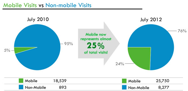
If you’ve made it difficult for these people to book a room or call your hotel by showing them a non-mobile optimized page when they arrive at your site, you’ve drastically cut your conversion rate for those visitors. You’ve made it much more difficult for them to navigate your cumbersome, standard website.
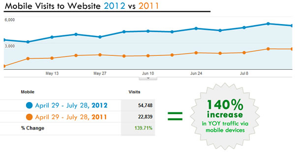
In another example, let’s compare three months worth of mobile traffic for a cluster of hotels in 2011 (orange) versus the same months in 2012 (blue). Comparing the same 3 months year-over-year we see an astounding 140% growth in mobile traffic to this website. And, as you can clearly see from the chart below, the mobile trend line continues to move upward and onward. In one year this cluster of hotels managed to more than double their mobile traffic (from 22,839 visits last year to 54,748 this year).
What does it mean to have a “mobile optimized” hotel website?
As you probably know, most modern smartphones are able to render mobile-optimized and non-mobile optimized sites without a problem. If you view any website in your mobile browser, chances are your Android, iPhone, or Windows phone will be able to show you the page without a hitch. But just because you can view a webpage on your mobile phone doesn’t means it’s optimized for that smaller screen size. Consumers interact with websites on mobile devices differently than they would on their standard computers, and because of this, your site should be optimized appropriately to help them accomplish their goals.
Consider these elements when creating a mobile-optimized hotel website:
- Consider your audience and how they’re consuming your content – We want to format our website in a way that makes it easier for consumers to browse our content no matter what device they are on. At the most basic level, this means creating two separate version of your website: one that can be viewed on a normal computer monitor, and one that can be viewed on a mobile device (which includes both smartphones and tablets). In order to send the correct version of the website to the correct visitor, some code is placed on the backend of the site that determines whether the user is viewing with a standard computer or a mobile device.Some businesses even go as far as to create separate website layouts to address the distinction between smartphones versus tablets within the “mobile devices” category. After all, the behavior of smartphone users is considerably different than that of tablet users. As such, the content should be structured in a way that is most conducive to the usage requirements of each type of visitor.There’s even a new web development technique called responsive web design, which involves a single website that reformats dynamically to the size of the user’s viewing screen. This is a great option that entails essentially creating three versions of the website (standard, tablet, smartphone) in one. Regardless of which technique is used–creating different versions of your website or using responsive web design–the goal is the same: present visitors with content that is optimized for viewing on their specific device.
- Show only the most important content – Mobile users navigate a site differently than their non-mobile counterparts. Things such as directions, contact info, and click-to-call are some of the most important actions a mobile user might want to make on your site. You probably don’t need to feature every little niche landing page you’ve ever created on your mobile site. Those kinds of pages likely aren’t at the top of the list of useful content for your mobile visitors, so they probably don’t need to be featured on your mobile site.
Consider this: according to an article in USA Today, Vice President of Marriott eMarketing Andrew Kauffmann states that about half of Marriott’s mobile bookings are same-day reservations. This means that these mobile guests will be probably be using their smartphones to 1) see photos of the hotel; 2) review accommodation options; 3) call the hotel with questions; 4) book their same-day reservation; or 5) find directions to the hotel. If you don’t have elements on your mobile-optimized site that quickly and clearly address these key customer goals, you’re making it much more difficult for those mobile users to become heads in your beds. - Avoid Adobe Flash – Many mobile phones, notably the ubiquitous iPhone, simply won’t display Adobe Flash content. Instead, that Flash content will show up as a nice, big, ugly grey box in the middle of your pretty website. If you think your standard website looks absolutely breathtaking with a nice Flash slideshow of your property on the homepage, keep in mind that most mobile users will never see it. With mobile-friendly HTML5 and jQuery alternatives, there is no reason a hotel should need to rely on Flash for their website slideshow or photo gallery.
- Make text larger – When mobile browsers render your non-mobile site they often start “zoomed out” to fit the entire webpage width in the screen. Then, for the visitor to read the teeny tiny text on the screen they have to pinch and zoom in order to hone in on the section they want to read. While many users have gotten used to this format, it’s far from ideal. For one thing, if you’ve zoomed into to one part of the screen to read an article, you then need to zoom out in order to reorient yourself within the page and then zoom into the next section of the page you want to read.
- Beware of small links for fat fingers – Similar to the previous item, small links on mobile devices can cause problems for even normal sized fingers, let alone those with over-sized digits. For instance, many main navigation bars have many links listed close together. If your site isn’t optimized for mobile devices it’s too easy to accidentally “click” the wrong link with your wide digits. Shoppers tend to get frustrated with having to constantly go back and try again; by utilizing a more ‘mobile-friendly’ template you’ll be able to get your potential guest the info they want more quickly.
- Improve cumbersome booking widgets – Don’t make booking a room at your hotel a chore for your mobile customers. For most mobile users a click-to-call button would easily accomplish the same function as a booking widget, but would require less steps and less input. There are likely many people that don’t want to have to manually enter their credit card information into your system to reserve their room. Ideally, you might give the mobile customer a choice: offer a click-to-call button but also offer a “Book Now” button that takes the user into your mobile-optimized reservation system. Regardless of what you offer, simpler is better on the mobile device.
- Streamline lengthy forms – Although I have some friends who can probably text faster than they can type on a standard keyboard, for most consumers it can be a pain to fill out lengthy forms on mobile devices. These kinds of forms might be okay when viewing the page on your standard computer, but no one wants to fill out 20 fields in a Contact Us form on a mobile device when a well-placed click-to-call phone number would accomplish the same goal much more quickly. Also, I’d venture to say that, based on my own experiences, consumers hate filling out lengthy forms anyway, regardless of whether your site is mobile optimized or not. Keep ’em short!
- Give customers the option to return to the non-mobile site – If you have a mobile-optimized version of your website, make sure you at least give your visitors the option to view your standard website. Since many mobile sites only display content that is most pertinent to the mobile user, oftentimes some of the standard website content might be omitted to avoid clutter. While this can be a good tactic, it can be quite frustrating to view a mobile website only to realize that the content you want to view is only available on the standard website.In fact, many sites now place a link at the bottom of their pages that says “view full website.” This ensures that your visitors aren’t trapped in mobile view if they’d prefer not to be.
- Track and analyze – Make sure you track the actions of your users across both your mobile-optimized and standard websites. You need to understand how mobile users are interacting with your content so you can help improve and refine their path to your desired goal: booking a room. Which mobile pages are most popular? Is there a call to action on those pages? If you find that too many visitors are clicking the “view full site” link then it might mean your mobile site has omitted important content that visitors want. You might even consider purchasing a call-tracking system to determine the conversion rate on your mobile website’s click-to-call button. If mobile visitors compose a quarter of your site traffic, it’s important to understand the how the conversion rates, booking windows, ADR and conversion funnel differ from that of visitors to your standard website. Chances are those two groups behave very differently, and understanding their actions can help you better guide those users towards their goal.

Optimizing your hotel website for the mobile visitor can have a tremendous impact on your mobile conversion rate. Simply by making it easier for that user to navigate your site on the small screen, you’ve given a boost to your mobile ROI. As such, the user experience on your website should always be one of your top priorities. Your website might feature great content, amazing photos and perfect calls-to-action, but if it’s excruciatingly difficult to navigate and view your site then you’ve failed to deliver that great content to your potential customers in a way that’s convenient for them.
Unless your site was built using responsive design, it is likely not a one-size-fit-all scenario. Yes, there will probably be an additional cost to create a second site targeted to mobile users. Yes, this means you may have to update two different versions of your website. But the alternative, if you don’t optimize the website format for this audience, is that you’re possibly missing out on a chance to convert a large segment of visitors to your site. Furthermore, with increased data speeds, easier-to-use mobile interfaces and faster smartphone processors, the mobile user base is only going to continue to expand.
Time for a little exercise: Take out your mobile phone and access your hotel’s website. So, how does it look? Will your mobile visitors be converting to paying guests?