Great marketing is all about being able to tap into the mind and predict the behavior of your target audience. Fortunately, doing so does not require any psychic abilities or doctorate degrees. Instead, several psychological tactics at your disposal can be used to help better understand your hotel’s audience and drive traffic as a result.
Introducing: the psychology of color – an approach that considers how color affects human behavior. Knowledge of this study can be used by both designers and marketers to influence customer reaction and emotional response to targeted messaging and product offerings. For hotel brands, in particular, incorporating elements of color psychology in marketing strategy can help develop an edge over the competition and drive revenue via direct bookings through your hotel website.
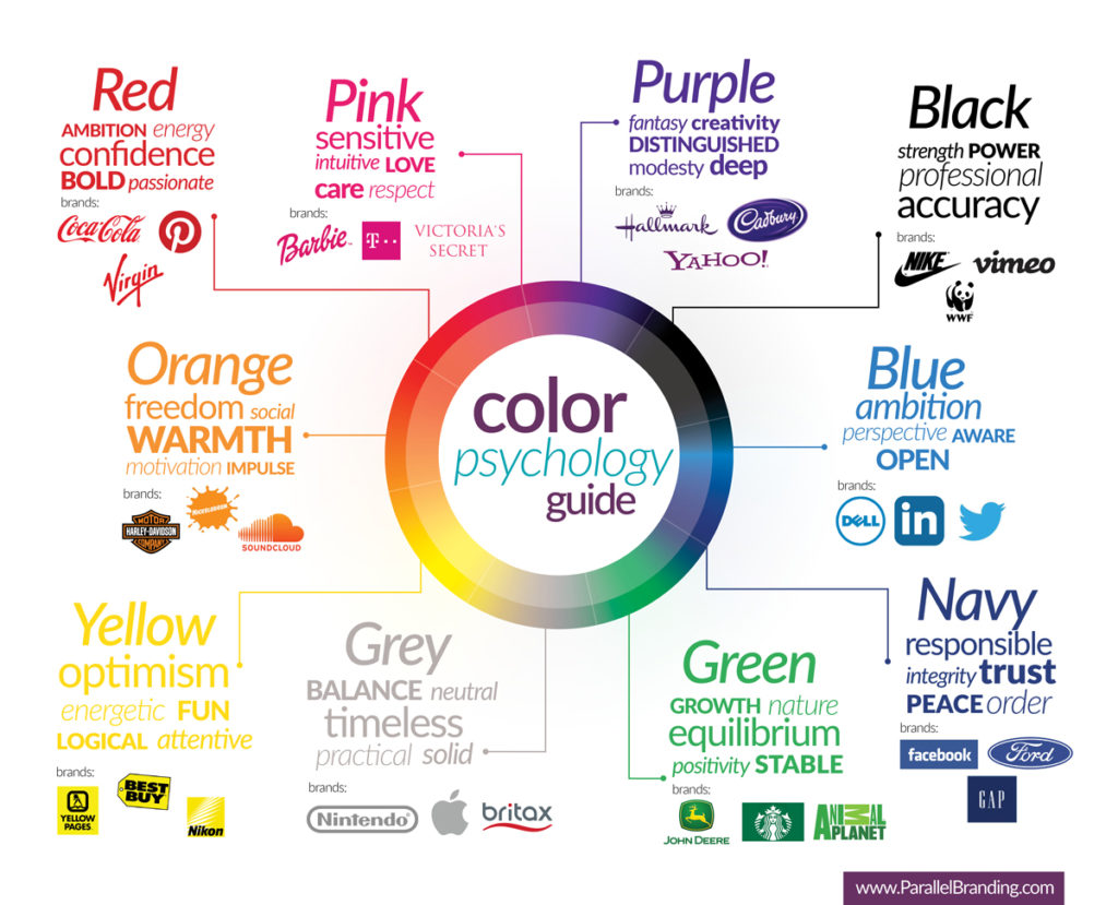
How does color impact our behavior?
Fun fact: We, as humans, evolved as visual beings with brains capable of processing imagery 60,000 times faster than that of standard text. Also, 90% of the information we process intellectually is visible.
We rely on visual perception as a sensor for surveying and interpreting our surrounding environment, much like a metal detector uses a magnetometer (magnetic sensor) to explore buried treasures. In relation, color acts as a trigger for a diverse set of responses within our brains and across the thought processes, movements, and sensations throughout our bodies. First-hand awareness of color is known to be one of the key drivers of human evolution. If color is so significant to the history of human evolvement, consider how critical is to the value of your brand.
Put it this way – if the cavemen found meaning and purpose in color, then the same would be true for modern travelers and by default, your hotel’s brand identity and digital presence.
How are significant brands using color to influence their audience?
While name, logo, or product type can distinguish unique brands, color is often the first thing to catch the viewer’s eye. Color theory, a concept adapted from principles of psychology, suggests brands can adopt visual identities (color schemes and color arrangement) to define the mood and influence the response of their target consumer. Studies show color has the ability to increase brand recognition (a direct link to consumer confidence), by 80%, with an average 85% of active shoppers naming color as a lead contributor to their purchasing decisions.
As the theory supports, distinct colors signify emotional attributes, which can be effectively used to convey brand messaging and guide customer experience. Corporations and big-brands use this as a powerful marketing tool, taking advantage of the opportunity to further influence their target market.
Branding Offline
McDonald’s has long been identified by its red signage and golden arches.The brand uses high-energy colors (red and yellow) as a means to appeal children and create a sense of urgency. The binary color scheme intends to stimulate appetite and drive impulse, the core business for any fast food restaurant.
A related example in the hospitality industry is Super 8 Motel’s usage of red and yellow. As a hotel relying on interstate billboards to grab the attention of their audience and thrives on last-minute, impulse bookings, their signature red/yellow signage also creates a sense of urgency to drive immediate hotel bookings.
Starbucks is one the few major brands that use green as its designated color. The color green universally associates with health, tranquility, power, and nature. Starbucks intends to promote a relaxing coffee shop environment stimulating harmony and leading to decisiveness in making a purchase.
From a hotel perspective, the Embassy Suites and Holiday Inn groups both employ the color green in their branding and overall marketing efforts. In the case of these two brands, the color green is meant to promote a relaxing, comfortable environment for their guests.
Hallmark is another time-honored brand that has remained dedicated to its purple-themed foundation. The company first introduced the Hallmark brand name as an ode to the hallmark stamp of authenticity, once used by the British to certify the purity and excellence of precious metals. Hallmark’s famous purple logo is representative of the color’s dual meaning – prestigious, decadent, and distinguished versus creative, sincere, and sensitive. The former, a nod to history and the latter, reflective of the company’s specialization in greeting cards.
The Cosmopolitan hotel uses purple in its heavy-handed branding to exude a prestigious, decadent, and distinguished atmosphere. Additionally, the Hotel at Midtown uses a combination of blue and purple hues to deliver a feeling of elite status and again, sense of prestige.
Park Hyatt, the luxury label of Hyatt Corporation’s hotel and hospitality line, stands out among sister brands with its sleek black and grey trademark. The colors were chosen to represent the Park Hyatt brand in support of a particular luxe feel, with shades of grey signifying excellence, class, and black- strength, and power.
Marriott’s Renaissance and Autograph Collection brands also use a sleek color scheme of black, grey, and white to convey a visual experience, similar to that of the Park Hyatt.
Branding Online
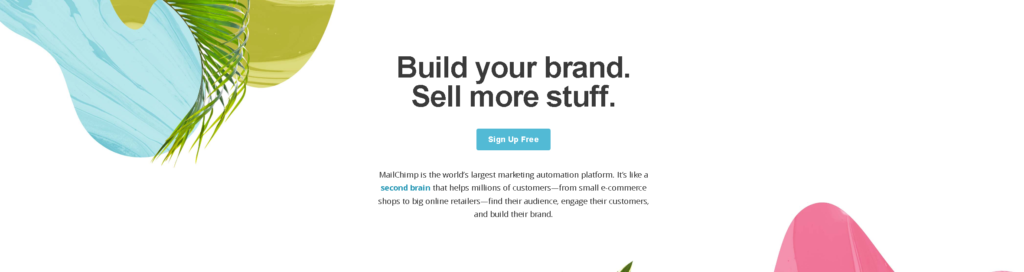
Mailchimp is one of the many online brands to utilize the psychological principle known as the isolation effect in their web design. Isolation effect occurs when certain visual elements are intentionally made to be more prominent than others and therefore more likely to be remembered. This principle applies to the design of Mailchimp’s homepage, with its white background setting apart the brand’s signature blue call-to-action button. The blue branding conveys a subtle message of trustworthiness and ambition while the value proposition emerges as dark, bolded text.
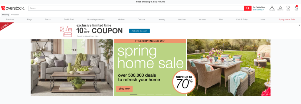
Overstock (Overstock.com) is an online brand that successfully utilizes a hierarchy of background, base, and accent colors on their site to coach customers into taking action. Here, we see the brand is using high contrast to promote its current sale while accents of its adopted shade of red sprinkle across the page. These accents of red are used to create a sense of urgency and ensure a particular offer is well noticeable. The color red is also attributed to the state of arousal, which can make customers more prone to persuasive messages.
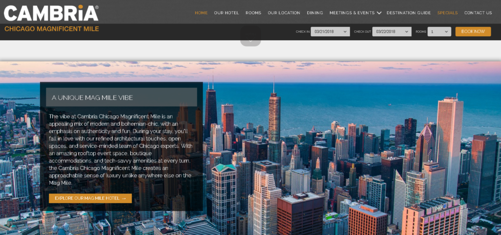
Call-to-action (CTA) buttons that are clear and use an appealing color can make a world of difference, especially when it comes to boosting hotel web conversion rates. Websites with clear CTA buttons are 47% more likely to attract site visitors to the button within 3 seconds or less of being on the site.The Cambria Hotel – Chicago Magnificent Mile, uses the color orange to highlight their ‘booking’ and ‘explore’ pages. Orange has a reputation for being especially appropriate when used for calls to action as the color represents a sense of urgency and intrinsically associates with ‘do.’ CTA buttons stand out among the site’s dark grey background to instantaneously grab audience attention and compel action.
How can you use color to drive website traffic and increase direct bookings?
One of the essential ways your brand can use color is to create a visual identity – helping to generate memorability and differentiate your hotel from other competing properties in your market.
Brand identity is one of the more crucial elements contributing to the conversion rate optimization of your website. The end goal is to maximize ROI and outperform your competition, no matter how strong. Optimization means improving every visual component of your website, and subsequently achieving better results.
How do brands go about doing this?
The first step is to identify the core components of your hotel brand personality online.
When it comes to picking the “right” color, research has found predicting consumer reaction to color appropriateness about the product is far more important than the individual element itself.
Identify your website’s character.
Consider the following questions when choosing a color scheme for your site design consistent with your hotel’s personality:
- What is your hotel’s positioning in regards to price point?
- High end?
- Low end?
- Mid-range?
- Who is your hotel target market?
- Gender?
- Age group?
- Family size?
- Type of traveler?
- What emotions/feelings does your hotel want to portray?
- Excitement?
- Happiness?
- Trust?
- Impulse?
- Tranquility?
- Optimism?
- Luxury?
Set the tone.
-
Consider using seasonal color palettes during different times of the year and specific holidays.
-
Implementing universal color schemes across your hotel’s website is an opportunity to simplify the experience of your audience as most will naturally associate your product offering with the occasion it intends to represent.
-
Incorporate contrast to reduce eye strain and direct audience attention towards specific items on a page, such as hotel accommodations, essential amenities, or direct booking.
-
Vibrancy can govern the emotional response visitors have to the design of a page on your site. Choosing brighter colors can lead visitors to feel more energetic, which increases the chances of a positive reaction when viewing specific hotel features, like rooms, dining, and special offers.
-
Pages incorporating the written content of a more vigorous tone, such as booking Terms and Conditions, may benefit from a darker color scheme, which will make information stand out and therefore easier for readers to process.
Align page elements.
When a potential guest lands on your website, he or she will quickly judge whether to continue navigating or leave immediately. Once the visitor is on the site, the images and the copy convince the visitor to take action: check the rate on a room, submit an RFP form, sign up for a newsletter, or follow the hotel on social media. The visual elements of your site hold the key to creating an interest that will ultimately lead them to written content and brand messaging. If the design fails to engage and retain the attention of your visitors, bounce rate increases and permanently lost segments of traffic are to be expected.
Utilize the background, base, and accent colors of your site to create a hierarchy designed to hold the attention and train the eye of your audience to recognize colors that influence response. At the minimum, you will need to identify three fundamental colors for your palette. If suitable colors are applied, and the right customers receive the message you are trying to convey, you will ultimately see increased conversions on ‘click to book’ pages.
- Background Color
- -This color is used the most and sets the general tone and feel of the site. A colored background can stir emotions with the power to imitate deep personal interaction.
- Base Color
- -This color is used to break up the background and is typically the baritone, the middle child, neither boring nor flashy but the glue holding it all together.
- Accent Color
- -This color is used the least but gives the site its personality. Unless you are using a monochromatic color scheme, your accent color will have an austere contrast to both your background and base- typically the boldest color on your site.
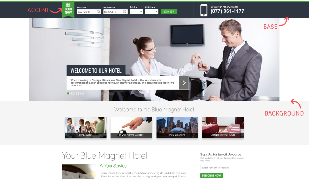
In the example above, white/light gray act as the background colors while a darker navy/grayish-blue acts as the base and a bright shade of green, the accent color.
If you want to increase your conversion rate, every element of your landing page (color, copy, design, speed, and call-to-action) must work together and ultimately align with your marketing goals. It is important to keep in mind the unique style of your hotel and how you want to convey that voice on each page of your website.
By combining a solid understanding of color psychology and the placement/positioning of elements, you can significantly improve the conversion and direct bookings rate of your hotel’s website.
Take a moment to look at your website through fresh eyes. Does your hotel website captivate potential guests with its design? Blue Magnet’s web design team will help you apply these psychological insights to your website. If you found this useful, then please subscribe to our email list, follow us on Facebook and Twitter to avoid missing other useful articles on hotel digital marketing.