

Keeping up with the constant change in styles and formats within web design can be difficult, but it does not have to be. Try not to fall behind the trends and have your website become outdated. It is our duty as web designers and web developers to consider best practices to keep our websites structurally sound and with the times. Maybe the key to solving the problem is to make our websites as evergreen as possible to ensure they remain relevant and require minimal updates.
Evergreen, not perfect.
These tips do not guarantee your website will be okay for another 10 years, but to make sure your website is designed and positioned in a way that it can easily adapt in the digital world. Here is how to keep your website easily maintained and relevant with as little effort as possible.
Proper framework is key.
A framework is the base foundation and supports the development of your website as a packaged structure complete with multiple files and folders consisting of HTML and CSS, or otherwise known as hypertext markup language and cascading style sheets. A proper framework is essential to the long-term success of your website.
Do not fight the inevitable.
Recognizing change and remaining nimble is fundamental to your success in digital marketing. Try not to get too comfortable, because change is perpetual, especially when it comes to the automated world. Keeping up to date on ever-evolving technology is near to impossible, but there is a way to stay applicable. According to Skillcrush, staying in the know is important, but that does not mean falling for every single trend. As web developers and designers, we know the tools we use in our daily work will no longer be the right tools for the job. There is really no pattern to the chaos; that is why we need to stay quick on our feet and watch out for any curveballs that may arise.
Choose a favored framework.
Finding a framework that is prominent in multiple development circles is key. If the framework is trusted by the majority of web developers and designers, chances are there is a reason. Although, it is smart to always do your research first before you act. Each framework has pros and cons. Some pros might outweigh certain favored frameworks for you personally. Everyone has different goals, and that is why it is important to remember that just because the majority of people use something, does not make it an end all be all. Make sure to tailor it to your hotel’s needs. Think about what you need before you choose.
Select a tried-and-true content management system.
Build on an open source CMS.
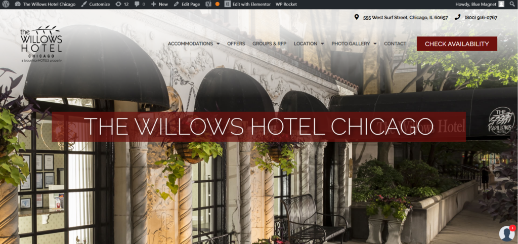
Open source content management systems are simple, yet complex. Find a CMS that is easy to work with and can evolve along with your needs. WordPress has proven to be a dependable option. As shown in the photo below, WordPress allows you to make changes to the website live through Elementor. Elementor is a drag and drop page builder plug-in that allows you to customize the content layout and make changes almost in an instant. Whatever CMS you choose, make sure that it has the capability to be flexible and functional and ready to change when you are. Open source content management systems can significantly lower costs with the same benefits.
Do not rely on third party operators.
Reliability is key. Third-party operators are not always reliable, and especially not free ones. A third party operator is defined as a party that is not directly involved but can help in numerous ways, such as a hotel booking engine. As consumers, we are always looking for the best possible price point and something that solves our problems with ease. Unfortunately, that does not always guarantee quality for the long haul. The more content you have, the harder it is to keep up with, and in return the more outdated content you have without even knowing it. Not to mention, these third party operators can slow down your site-speed, especially if they are of lower quality.
Build on a foundation of responsive design.
Start with a solid foundation.
Change can be a good thing, and a solid base of responsive design throughout all platforms is a good way to start. Responsive design means that a website’s design will render well on just about any device, whether it be displayed on a window or different screen sizes. We are in a day and age where every website that is built needs to be just as easily navigated on a phone or a tablet as it can be on a computer. So do your research, test out concepts, and always double-check your work on mobile once it is finished.
Think mobile-friendly design.
With the explosion of mobile devices being used as a primary browsing option this is essential to the long-term success of your website overall. It will build trust with your users and qualifies you to be more competitive in return. According to Search Engine Land, 54% of all internet traffic comes from mobile phones – and that number is continuously growing.
Keep it simple.
Stay minimalistic.
The more minimalistic your design the easier it is to maintain. Make sure when building your website to preference evergreen decisions. According to Canva, bold trends do not last long, and you want your website to age with dignity. An example is the splash page shown below. Splash pages precede any other page on your website and are to inform purposefully, but the problem is that they are not always executed properly and can become more complicated than helpful. Splash pages were quite popular last year for a brief amount of time, but according to Lifewire, the usability of splash pages are flawed and it causes many website visitors to bounce. Once this trend had taken its course, it was up to the website designers and developers to remove the elaborate splash page and find a solution to the problem.
Stick with the classics.
A classic piece of content that never goes out of style is the way to go. On special occasions, deluxe solutions might help benefit your website, but in terms of the bigger picture, sticking with the classics is a better strategy. Trends come and go, but you want your website to stay useful for years to come. For example, splash pages and flash animation were trends that had trouble staying relevant and permanent. These trends disappeared just as quickly as they arrived. You never want something like that to be featured on your website. This will determine your website’s quality before you even have the chance to establish trust with consumers.
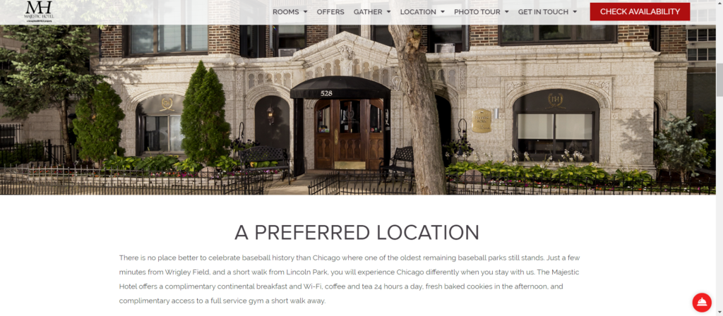
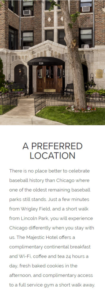
The Ivy Hotel knows its customers appreciate knowing what is happening around the hotel and what specials are being offered. In response to this, they had a slider menu created with specials and offers easily accessible, shown below. This is a perfect example of evergreen content that can be updated with ease. This particular guideline can be hard to follow for everyone, especially if you are doing work for a client that has special wants or needs, but it is definitely something to keep in mind.

Relevant content only.
Run quality assurance checks.
Run quality assurance checks on your website frequently to promise a better user experience, and fewer future improvements. It’s always a good idea to have more than one pair of eyes on something. Quality assurance can help improve the process and quality of work produced, and in return, less time wasted. It is part of human nature to accidentally overlook things when you have been staring at a screen for hours on end. There are plenty of free quality assurance tools that will help catch your mistakes.
Learn from your competitors.
Take note of what your competitors are doing wrong and what they are doing right. Learn lessons and build on them. Continuous learning is a requirement in this industry because nothing in digital marketing is ever set in stone.
When should you start from scratch?
It is impossible to predict the future.
There really is no right or wrong timeline, but assuming your website will last 10 years is a bit naive. There is no way to account for every development issue that could arise, but the average recommendation for a rebuild, according to past trends and Walkers and Digital, is around 3 years. Make sure to leave room in your budget for small improvements along the way and plan for a full rebuild sometime in the future. Moral of the story is to always plan ahead.
Need help future-proofing your hotel website? Contact Blue Magnet Interactive today.