
Pull a stranger off any street in America and ask them if they own a smartphone. What would you expect the answer to be?
A 2014 comprehensive study from the Pew Research Center suggests two out of three people have a smartphone in their pocket. Users are texting, emailing, banking, shopping for last minute Mother’s Day gifts, streaming Netflix, and looking up that tidbit of information to prove their friends wrong. When thinking about hospitality marketing services, it becomes abundantly clear why all of these users are significant. Hotel rooms are constantly searched for and room nights booked from the fingers of guests tapping away on a multitude of devices.
Website content must be optimized for both desktop and mobile browsing – not a maybe, or kinda, a big MUST. If a site is not properly delivered on different sizes and formats, the result will be a decrease in usability and disengagement from the user. Your hotel can actually suffer revenue loss if your site lacks the proper mobile optimization. Instead, a successful marketing agency will capitalize on the ability to generate content for both mobile and desktop and the value of the page increases exponentially. Delivery of content is just as important as the content itself.
Mobile Responsive Site Design
Users interact with websites in a variety of ways – different devices, browsers, and screen sizes – resulting in content being delivered in a multitude of formats. This causes the potential for discrepancies in usability and sub-par optimization. Simply put, if you try to use a site optimized for desktop browsing on mobile, you are going to have a bad experience. Content is displayed differently when you have a large horizontal window compressed into a much smaller, vertical screen. The difference in window size can cause pictures to appear distorted, sentences to be cut off, and content sections jumbled – creating a gap in the user’s experience. To add insult to injury, your site can be penalized on a technical level if you have not taken mobile browsing into consideration. The problems do not stop there because website visitors can also have much different motives based on their browsing format. A potential customer looking to book a hotel room on desktop will want to read thorough descriptions of the hotel and amenities – high resolution photo galleries and enticing inner pages are perfect for desktop users. Conversely, mobile users are going to be looking for a separate experience, typically in the form of streamlined, easy-to-navigate, mobile-friendly content. It is likely that a mobile user is not looking to do as much in-depth research about the hotel; if they are hit with walls of text that require their fingers to compete in a scrolling half-marathon, mobile users are going to be drawn away from your site. Based upon a sampling of Blue Magnet’s responsive hotel websites, desktop users spend on average 1 minute and 21 seconds longer on site than mobile users. Users who come to your site want to interact with epic content and your goal is to make this interaction as pleasant as possible.
Mobile Responsive Strategy
The ways users consume content is influenced by their platform and devices, but the true question to be asked is: why is this important, and how can it be capitalized upon? The answer is simple when the intent of the consumer is considered. People will use a site in different ways. The trick is to be prepared for the user’s end goal and make it part of your online hotel marketing strategy. From day one, content should be written and designed to be packaged and delivered on all appropriate mediums. For example, users that interact with a site from mobile platforms are fundamentally different; marketing efforts should reflect this. A potential guest looking for a room in the passenger seat of a moving car is going to have inherently different goals than a travel blogger stuck at home on a rainy day. From a strategic perspective, it is awesome to have the option to write mobile and non-mobile content. Flexibility is a wonderful tool that can be utilized, but the question that lingers, is how do we accomplish this?
Optimized Content
Plan, display, and deliver your content appropriately to different types of users. Think simply and proactively, give mobile browsers content that is optimized for mobile consumption, and provide desktop users with interactive content. Ensure nothing is missed by following this checklist:
Step 1
Responsive webdesign is king. Your content should be legible and neat on all sizes, all devices, and all browsers. Making sure your images are appropriately sized for different screens and that your text does not cut off can go a long way in drastically improving the mobile user experience.
Unresponsive Responsive
Step 2
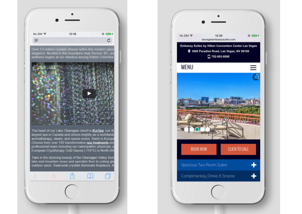
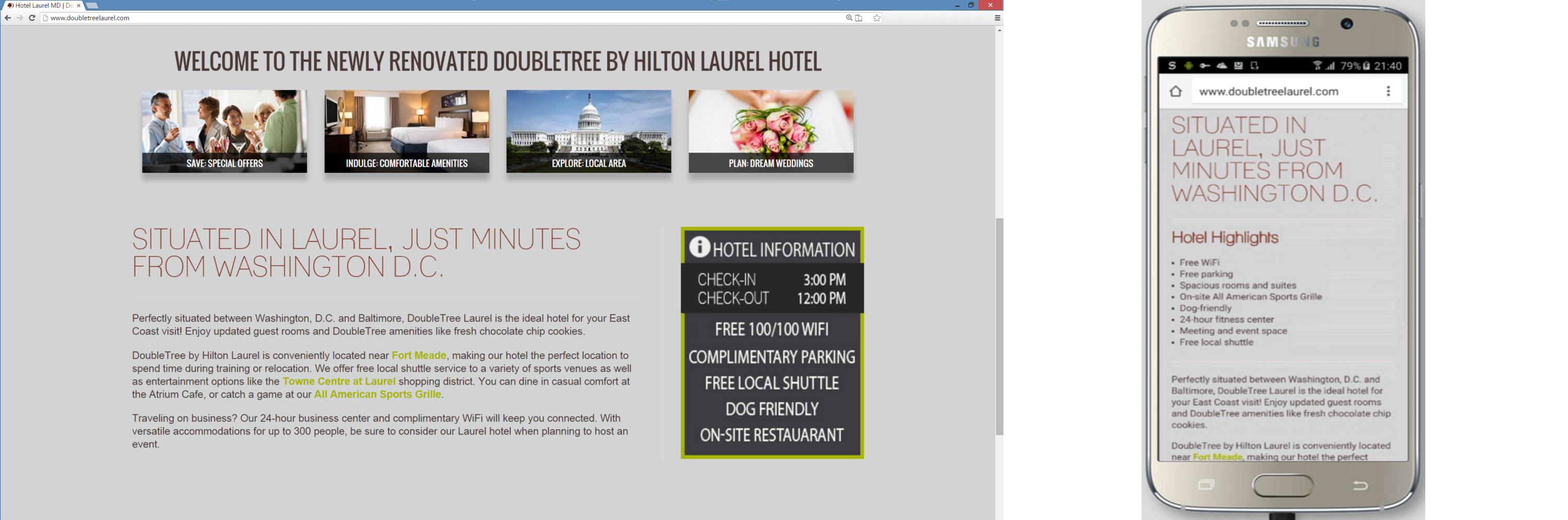
Display appropriate content to the right customers using or tags to assign content to appear for desktop or mobile users. The example below shows a Blue Magnet site in desktop and how different information is delivered on a mobile platform. Notice how the photo callout boxes disappear on mobile allowing users to get straight to the content that has been summarized into bullet form
Desktop Version Mobile Version
Step 3
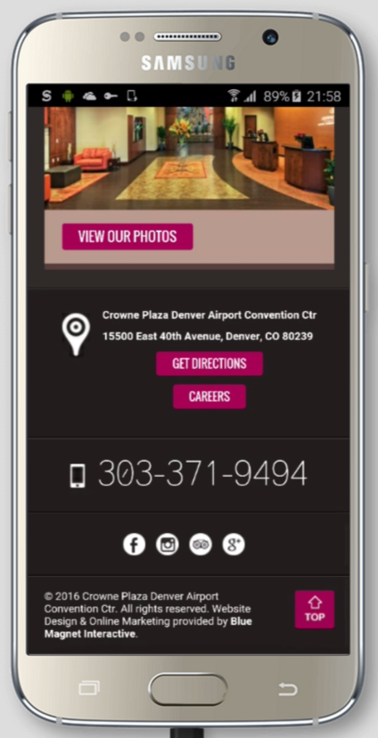
Usability should be an important discussion as well. Google’s mobile algorithm and responsive tester tool place high value on the size of the text and the spacing between the touch elements. With this in mind, evaluate how easily mobile users navigate, click links, or access menus. Consider adding elements to facilitate users’ navigation of the site. For example, turning a clickable text link into a button will help users with clumsy fingers. In the example shown, the site has a button to receive directions, a click-to-call interactive button, and a quick “back to top” button for enhanced user experience. These easy to implement features can go a long way and capture additional bookings.
Step 4
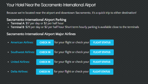
Target content to each specific type of user that the site will encounter. A perfect example can be seen on the following site. The desktop version has a robust, epic airline tracker widget on the page. Users can check the status of their upcoming flights, check in on the day of their flight, or navigate to their airline’s website directly.
A user on mobile would be overwhelmed with three different choices for each airline and it would be difficult to conveniently display each link in a format that would look good. Instead, the following content lives on the mobile version.
Each of the three airline’s clickable links have been replaced by a simple button, aiding the user in making a quick, convenient selection. But what makes this change truly work is that the new button sends users directly to each airline’s dedicated mobile site, making the transition 100% seamless and providing exceptional value to the consumer using the hotel’s website.
What is at stake?
An un-optimized site can deter users, or even worse, give them a negative impression of your brand. An eCommerce site can easily lose money or take a hit in revenue simply because its content reaches the consumer in the wrong way. Hotels wish to be as convenient and helpful as they can be to guests – this is an experience that should start before the customer has even booked a room night. Optimizing website content is the first step in providing users with exactly what they are looking for. A potential customer that gets frustrated with a website because they are getting served the wrong content can be considered a lost customer. A hotel can not claim to be helpful and convenient if their potential customers can not use their site properly.
Enough of the Debbie downer talk (sorry Debbies of the world). The content gap should not be considered a threat, but instead, an opportunity. Use content to wow the user; show them how valuable the site they landed on can be. A hotel’s digital content should be as helpful as the concierge that has worked a tad too long and knows exactly what time the lions feed at the local zoo. When it boils down to it, provide users with exactly what they are looking for, not generic copy that drones on about common hotel amenities if the user is trying to book a last minute room on the highway. It does not matter if Shakespeare himself wrote the copy; if it is not valuable, the prose is actually taking the customer out of the sales funnel.
That’s All Folks
There are many examples of what makes a site properly optimized (and plenty of bad examples too). If you have any further questions of how to construct a responsive website with awesome copy, drop us a line, we would love to chat.